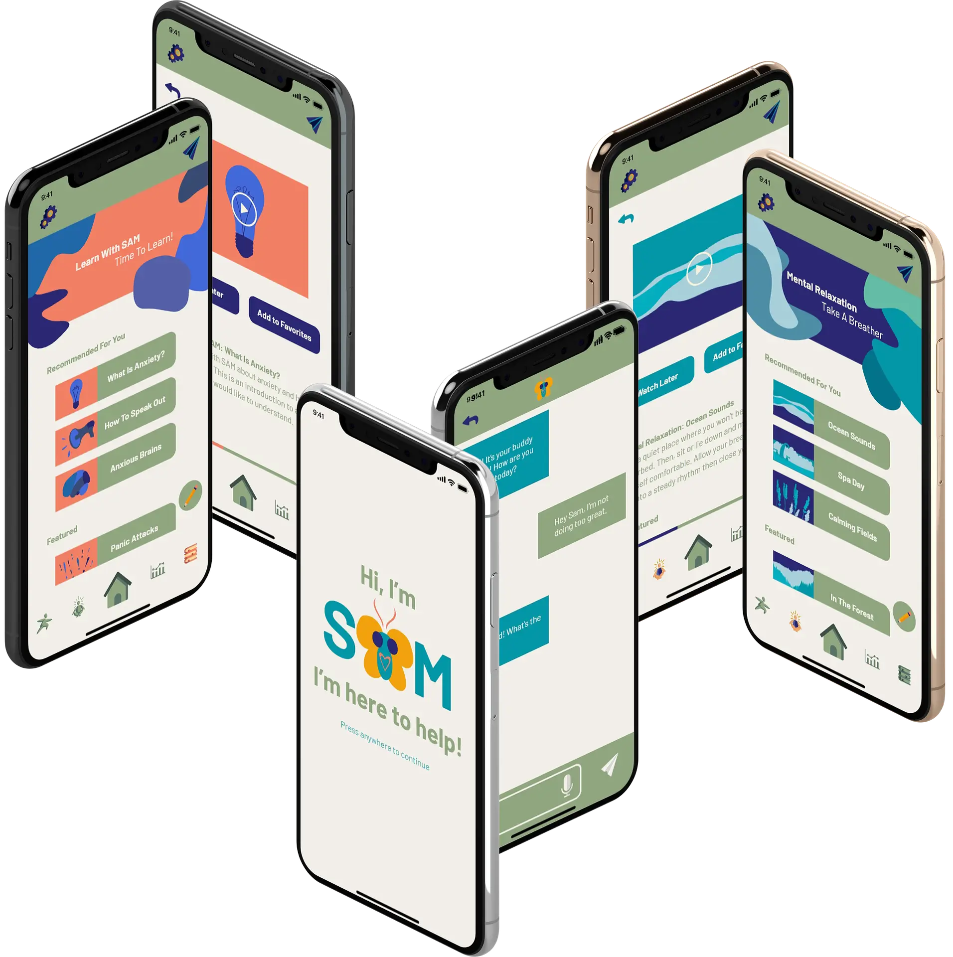
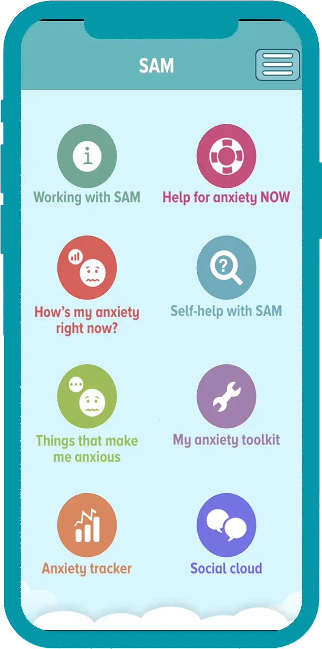
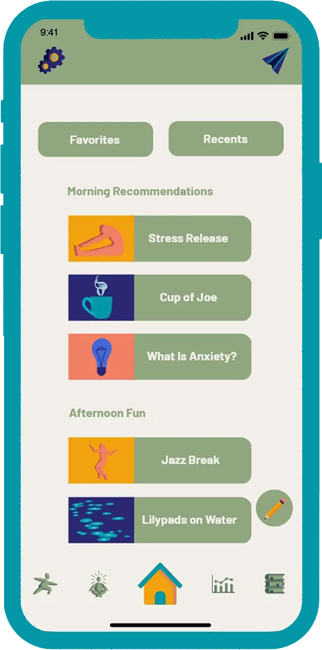
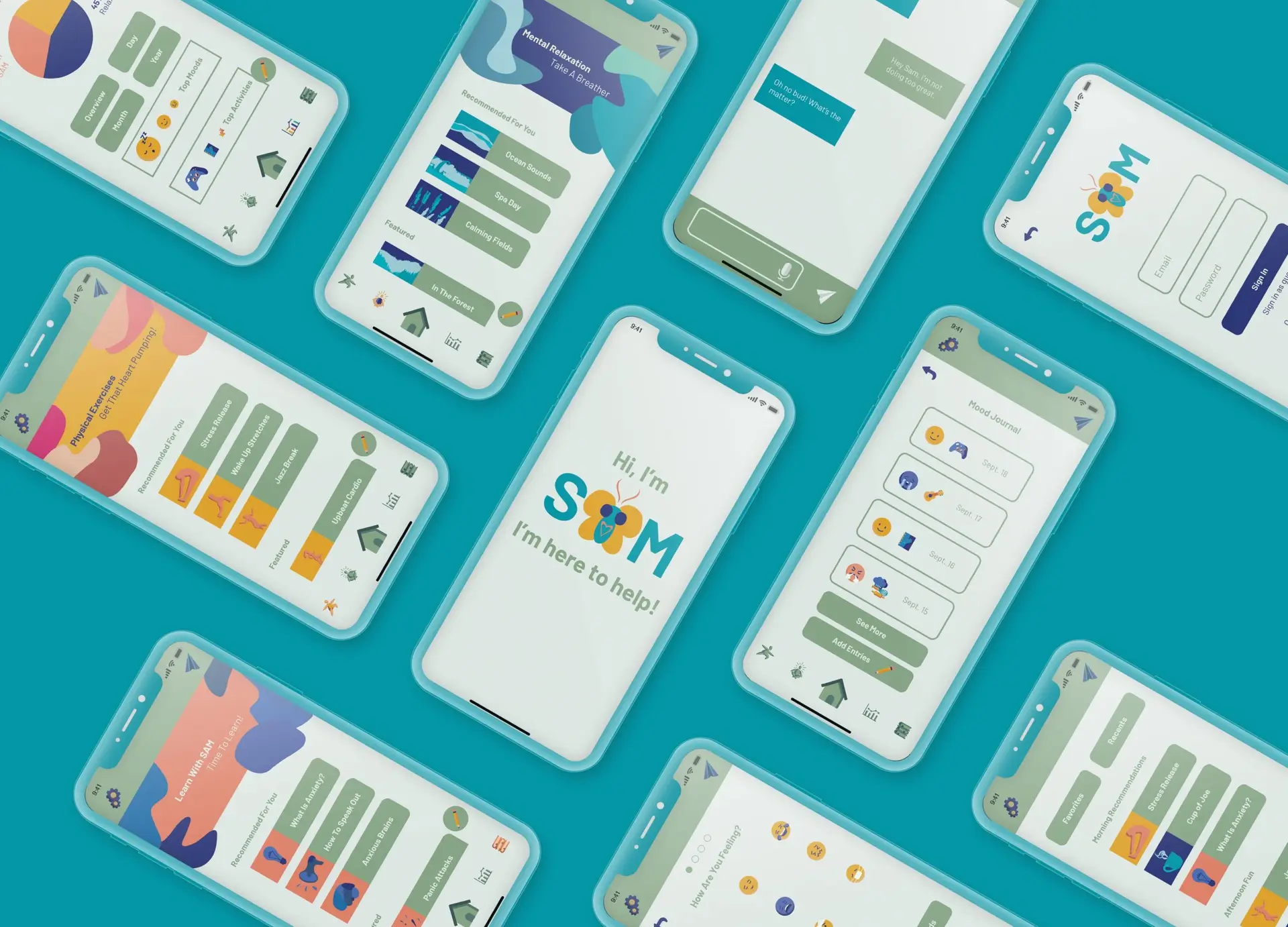
The S.A.M. (Self-Help Anxiety Management) App focuses on guiding users who suffer from anxiety to control and understand what they’re going through. The app has features such as a journal to write progress daily and mini lessons that teach what anxiety is and how to cope.
Before
After
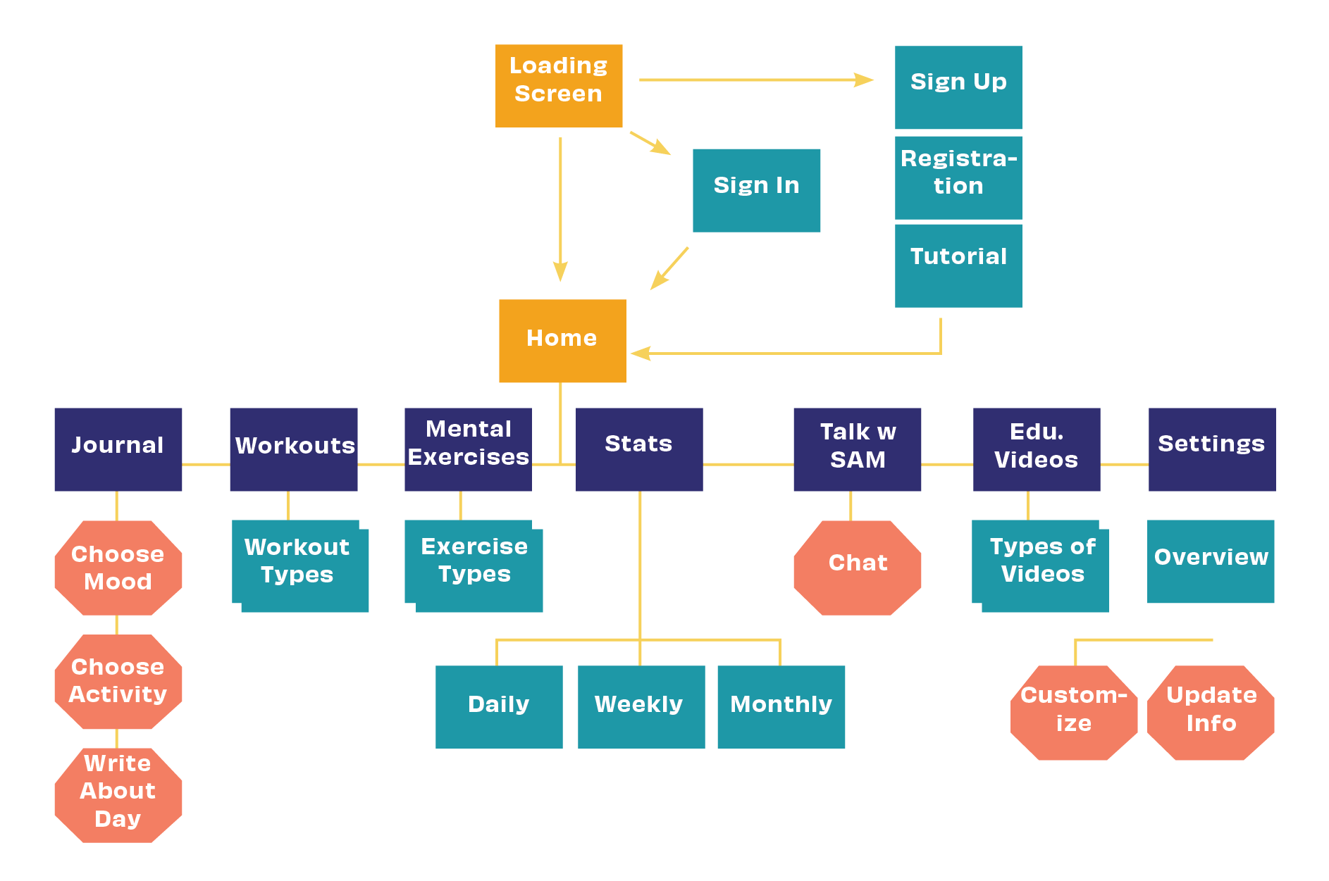
Mapping
When planning an app–or anything user-focused–a user flow is beneficial. It helps the designer understand what paths the user may take within the product. In my case, I wanted to be sure to map out all the functions and features of the app, so I know where to make connections within the prototype.
Brand Standards
I wanted the app to have a calming and simple design. Considering it’s geared towards those with anxiety. The color palette is neutral with pops of color that don’t overwhelm the senses and the type is friendly and welcoming.
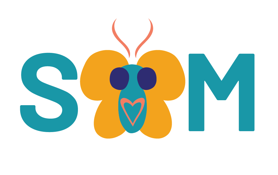
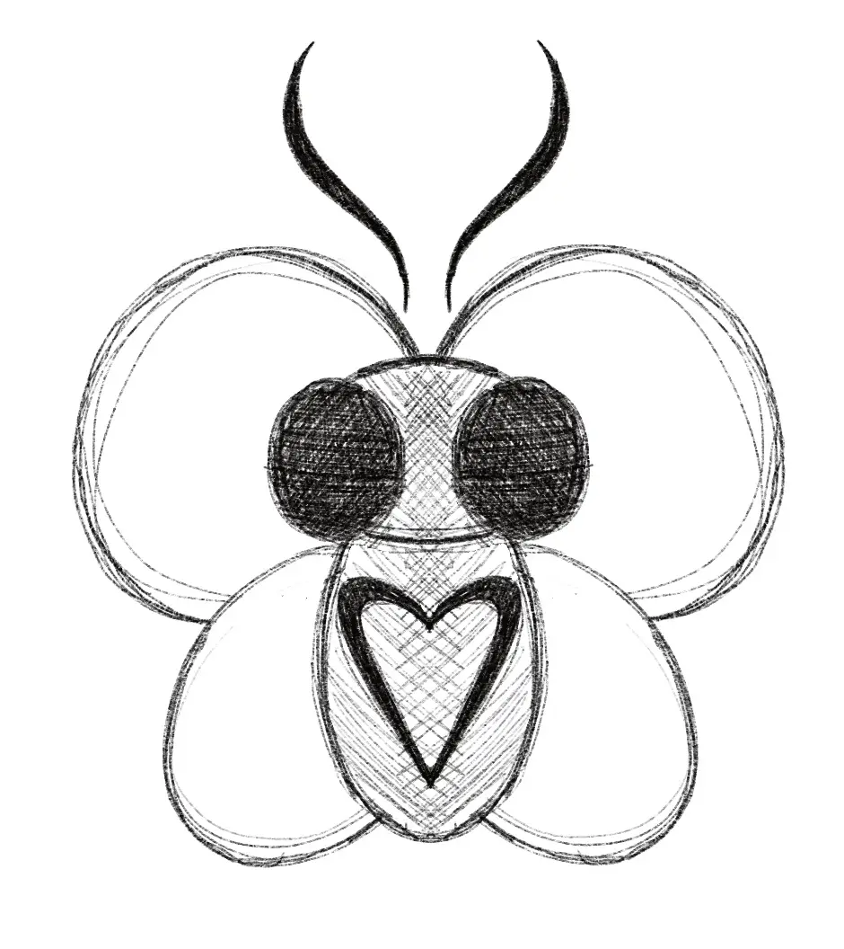
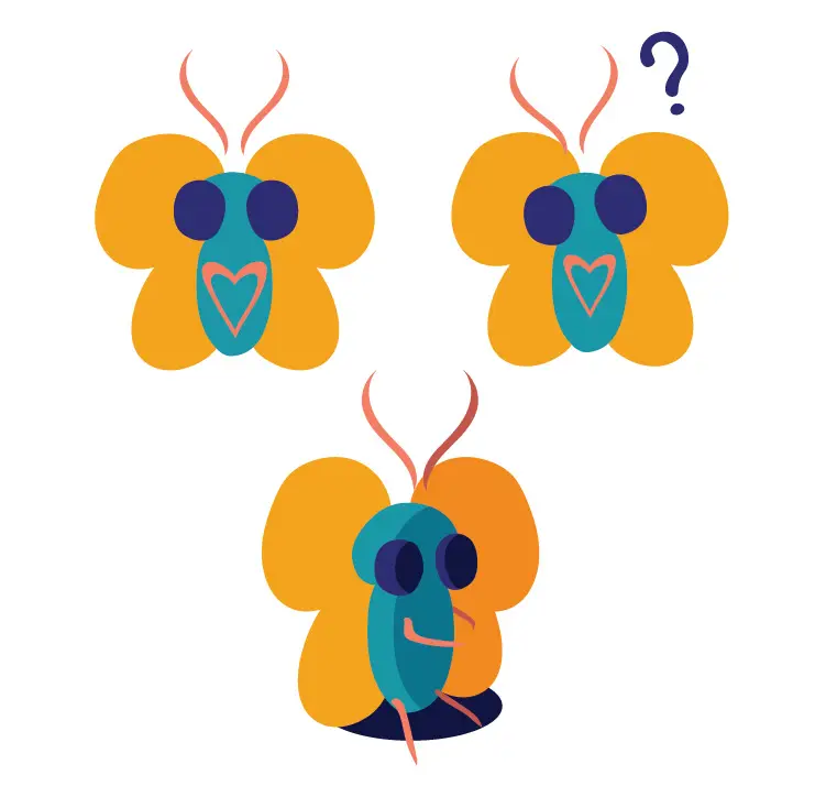
The logo includes the newly created mascot, Sam the Butterfly. They fit perfectly as the ‘A’ and welcomed users into the app with a kind face.
Sam the Butterfly
When looking at the original app, I saw an opportunity. Meet Sam the Butterfly. They are here to help you through your journey of self-help. Sam came from the idea of having a buddy to guide the user and be a friendly face in a tough process. They’re also very cute.
Solution
During the process of user research, many students mention having financial struggles. This was mainly due to not being taught what was needed in their younger years. There wasn’t a credit-specific app or program outside of the general financial literacy apps. I wanted to use this opportunity to create something valuable and useful to the users through fun aesthetics and easy-to-understand lessons, along with the real-life lesson of keeping track of the credit they earn.