Designs

Telltale Games Rebrand

Overview

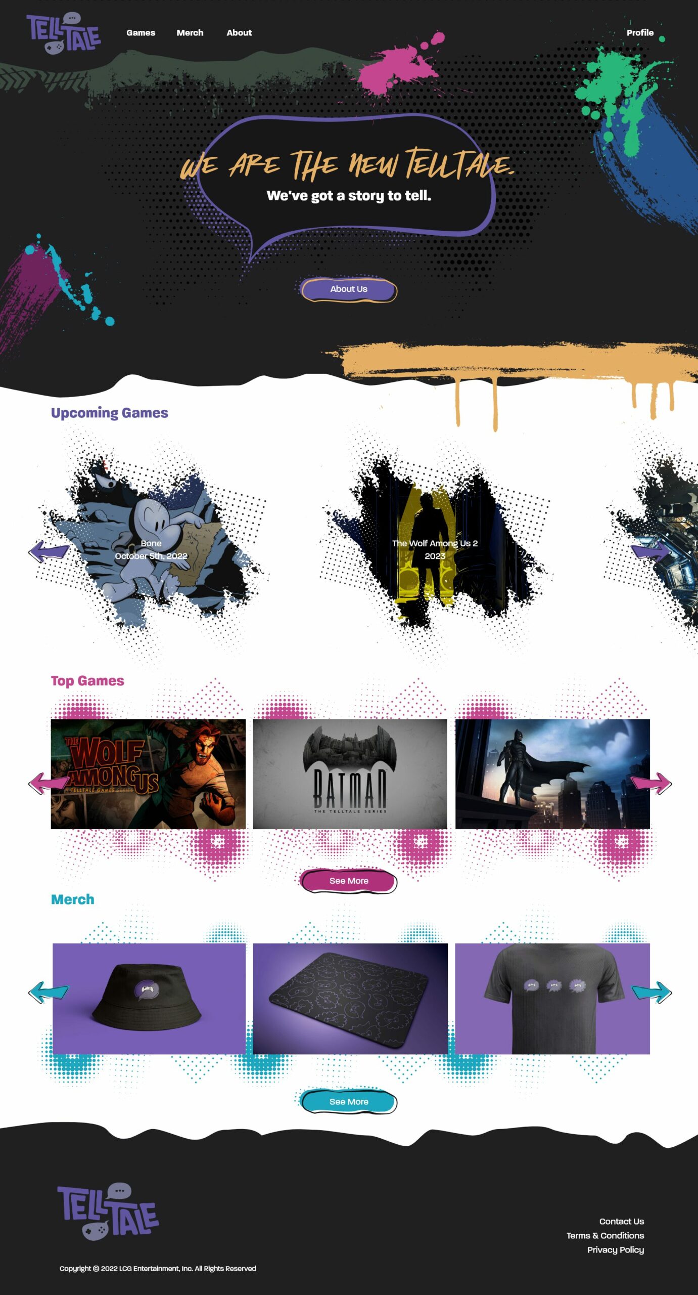
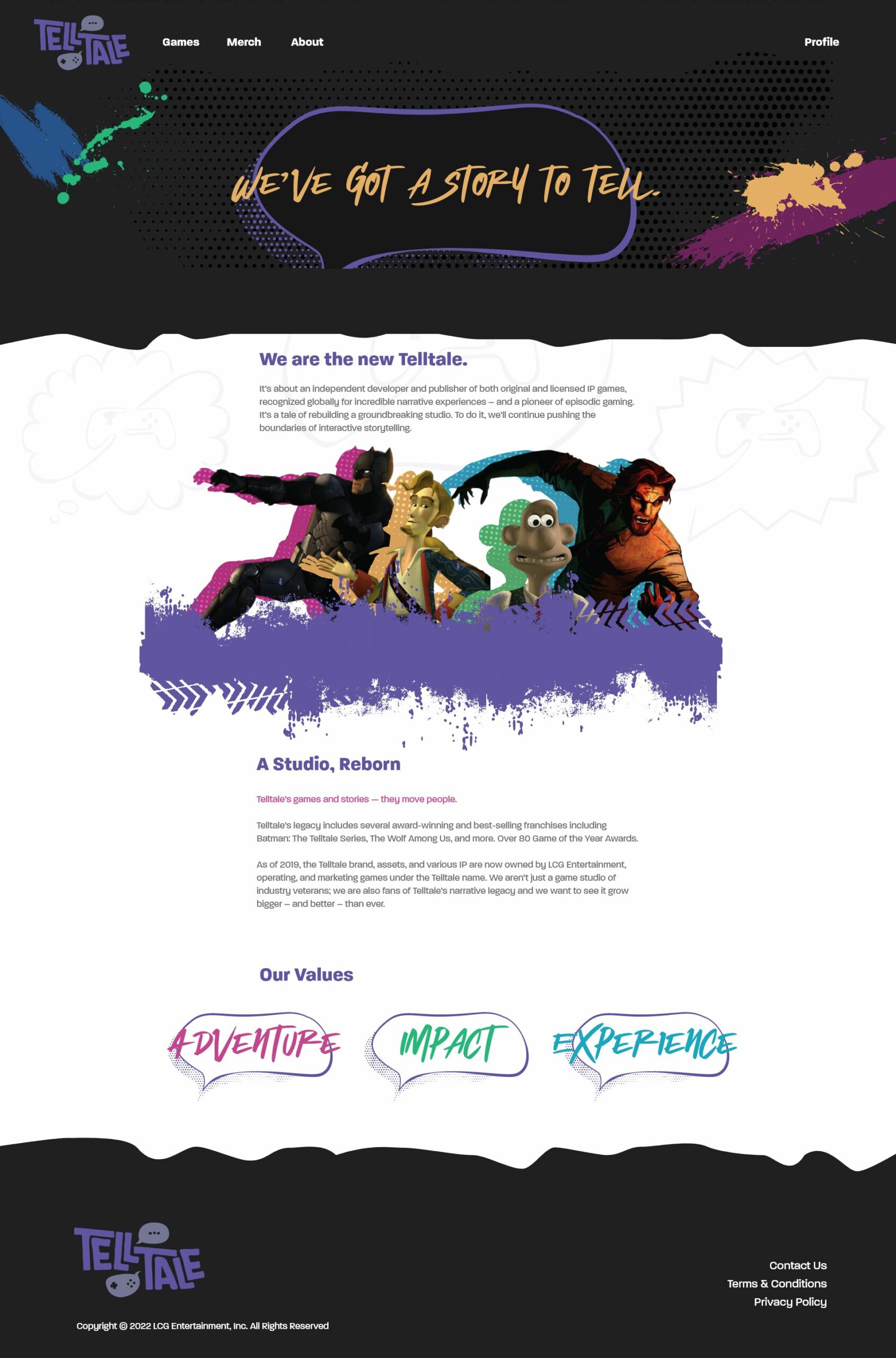
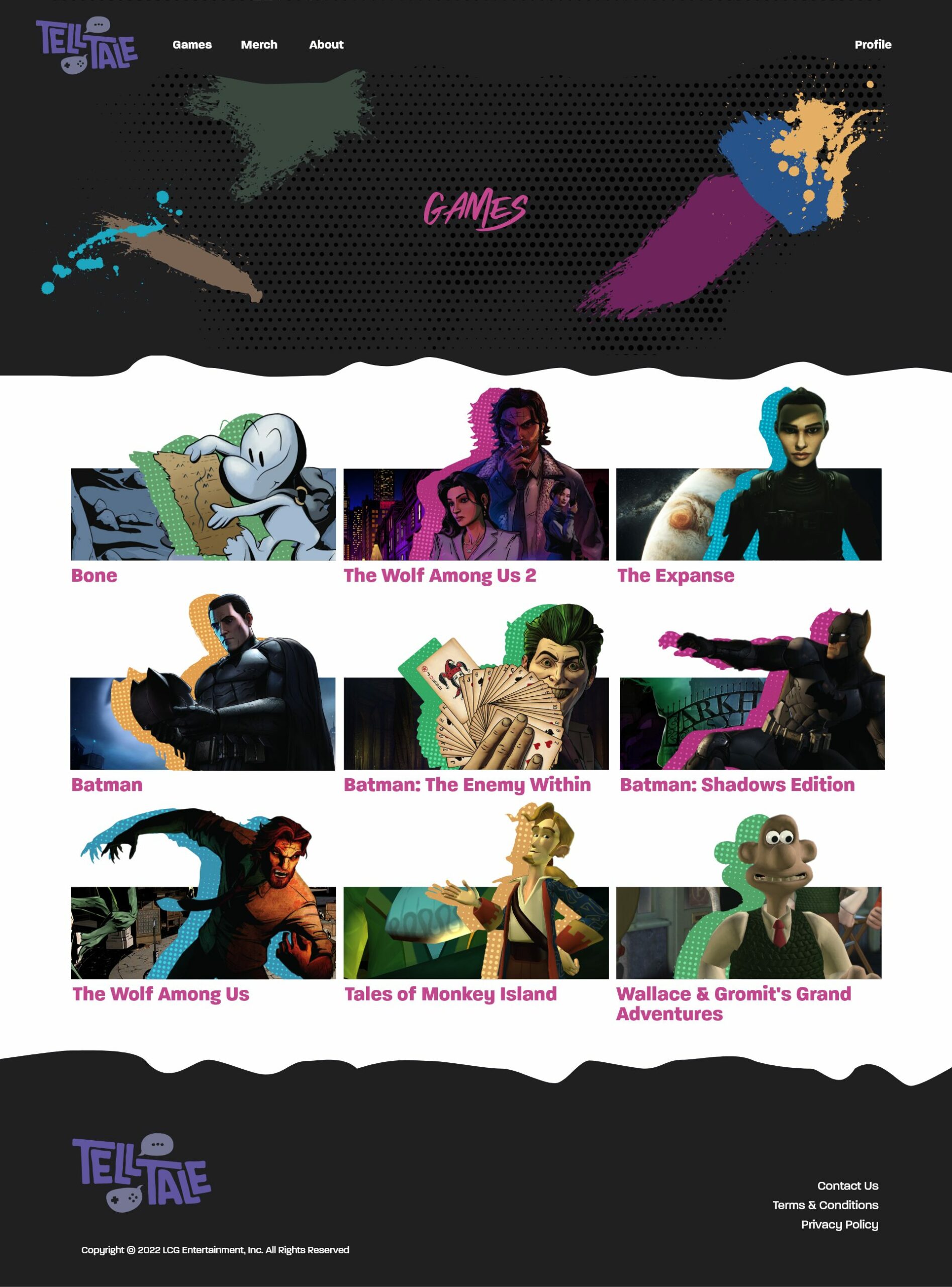
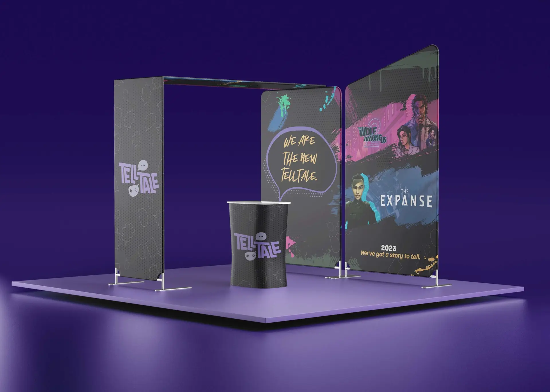
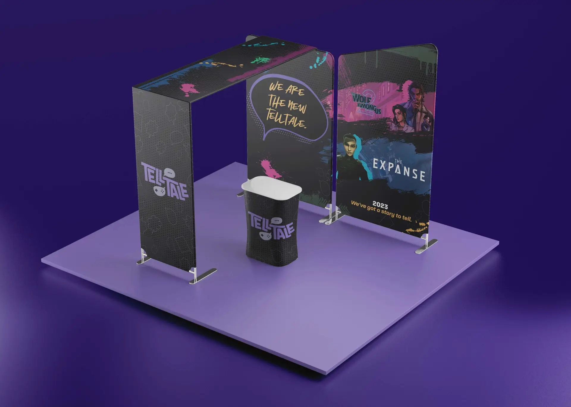
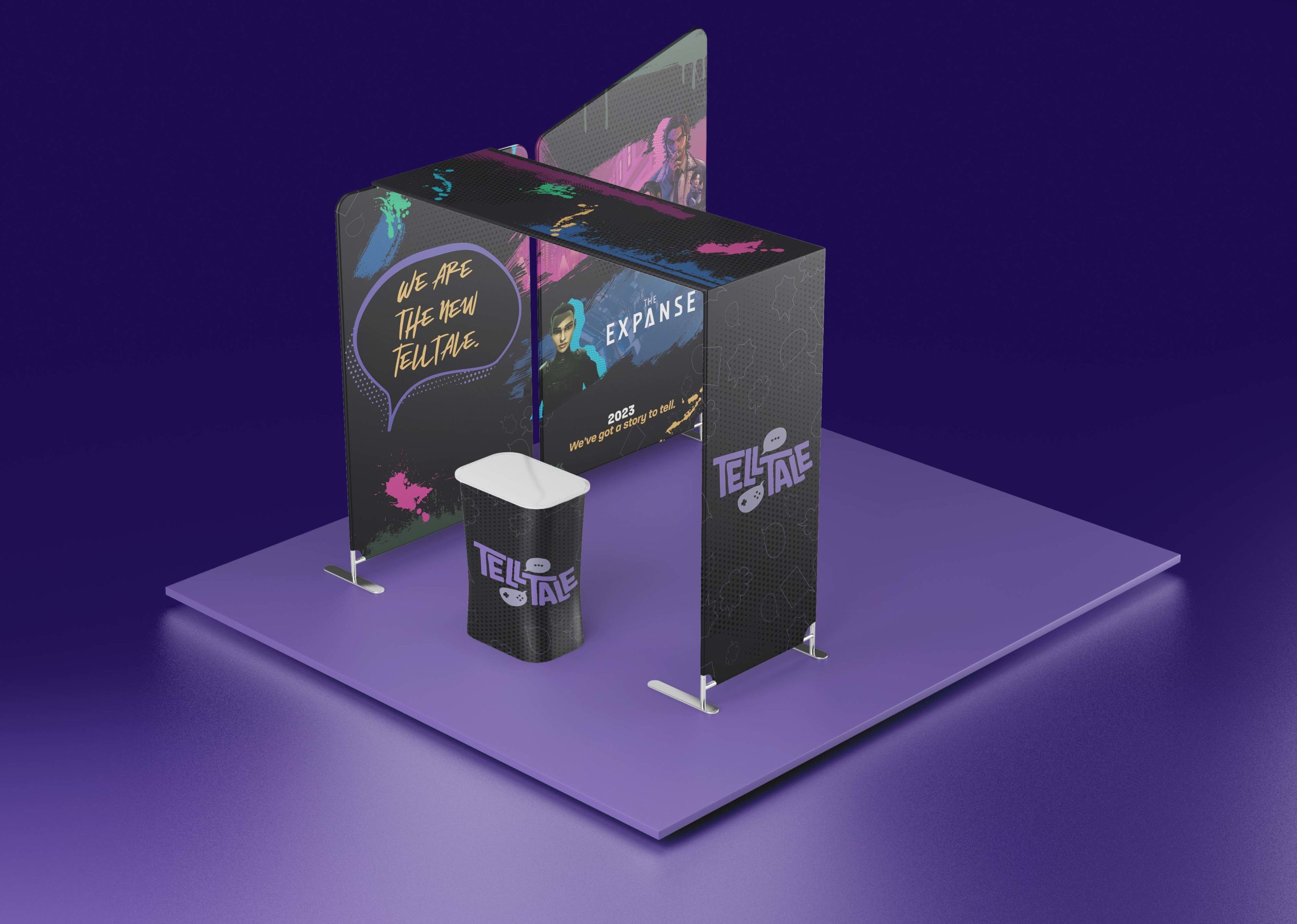
Telltale Games is described as the “pioneer” of episodic gaming and has inspired many video game companies with their array of games. However, in 2018 they shut down due to bankruptcy and were bought by LCG Entertainment the following year. At this point in time, they are presenting themselves as the “new Telltale.”

Solution

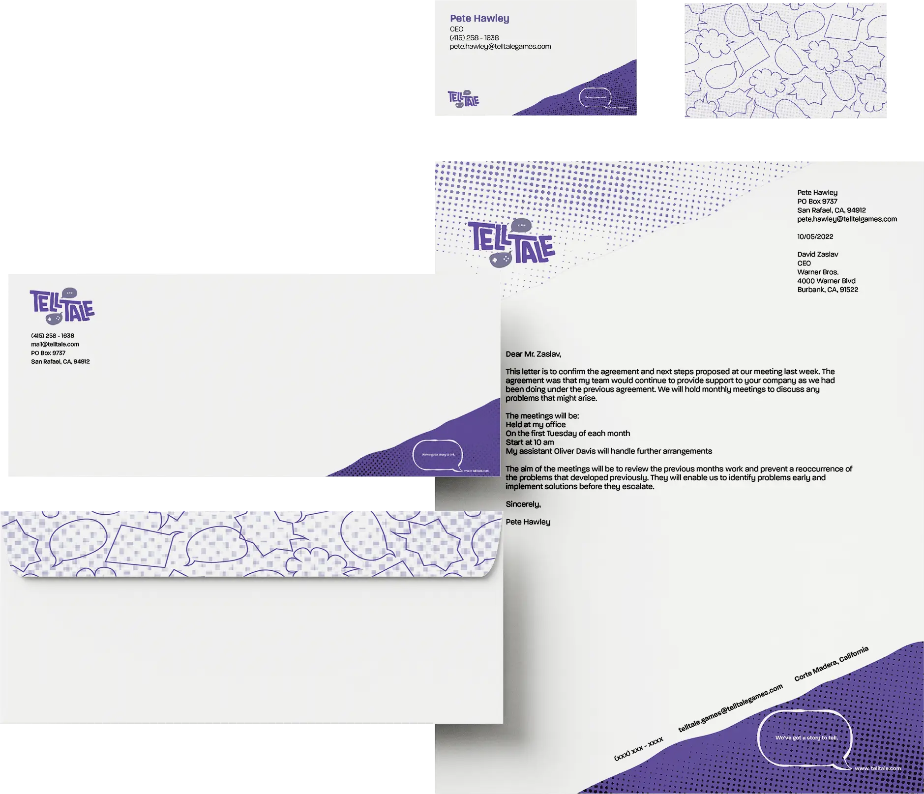
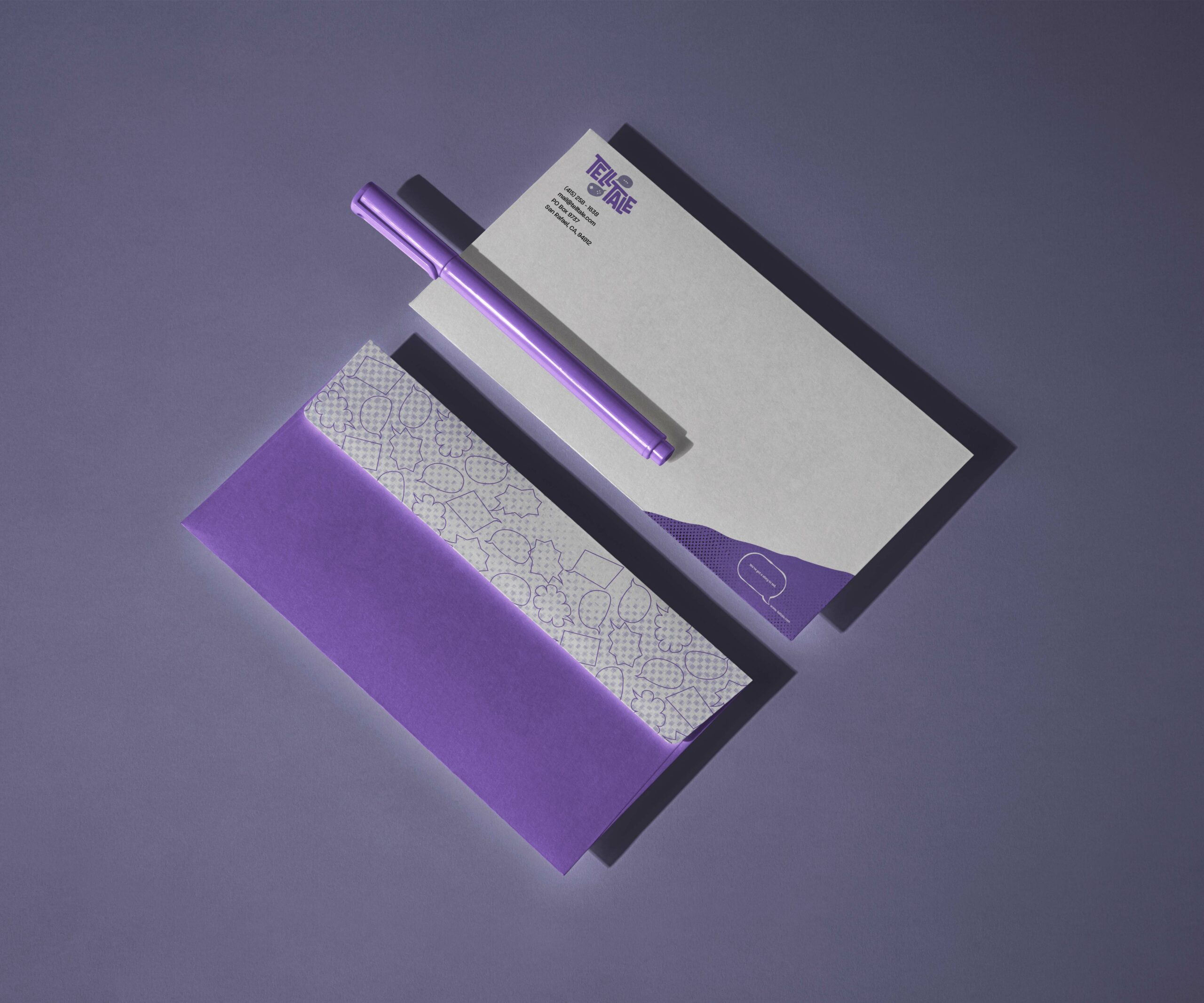
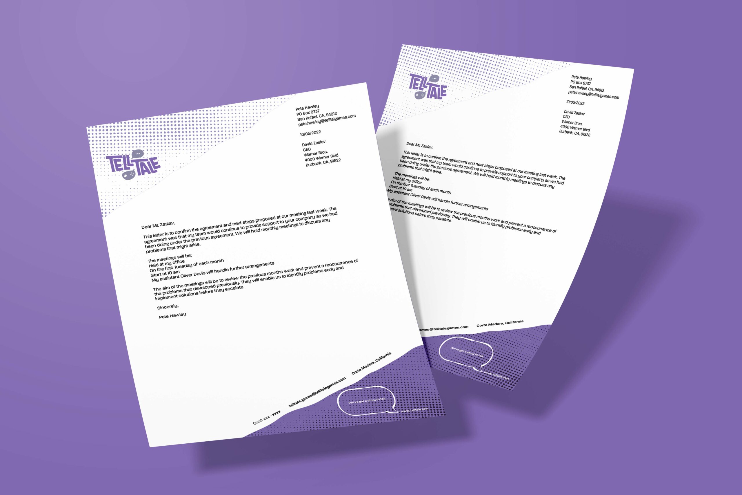
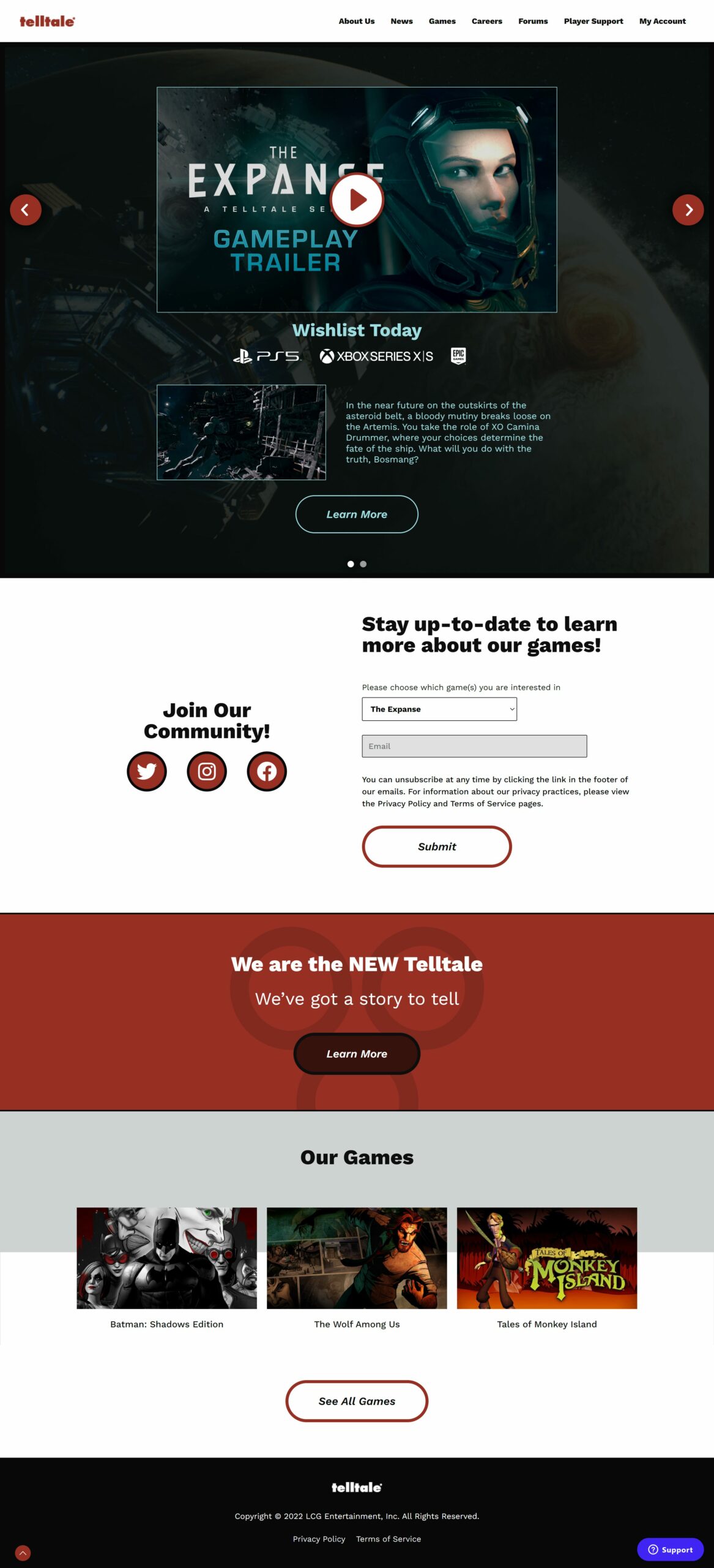
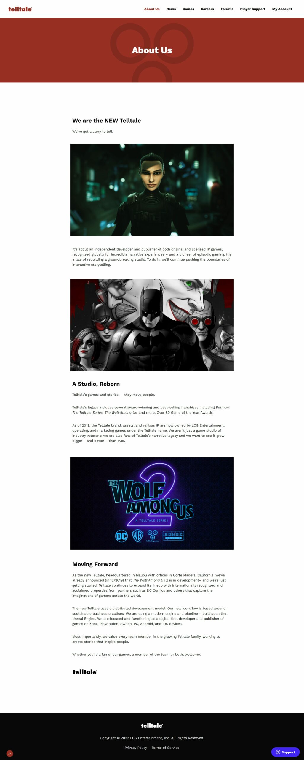
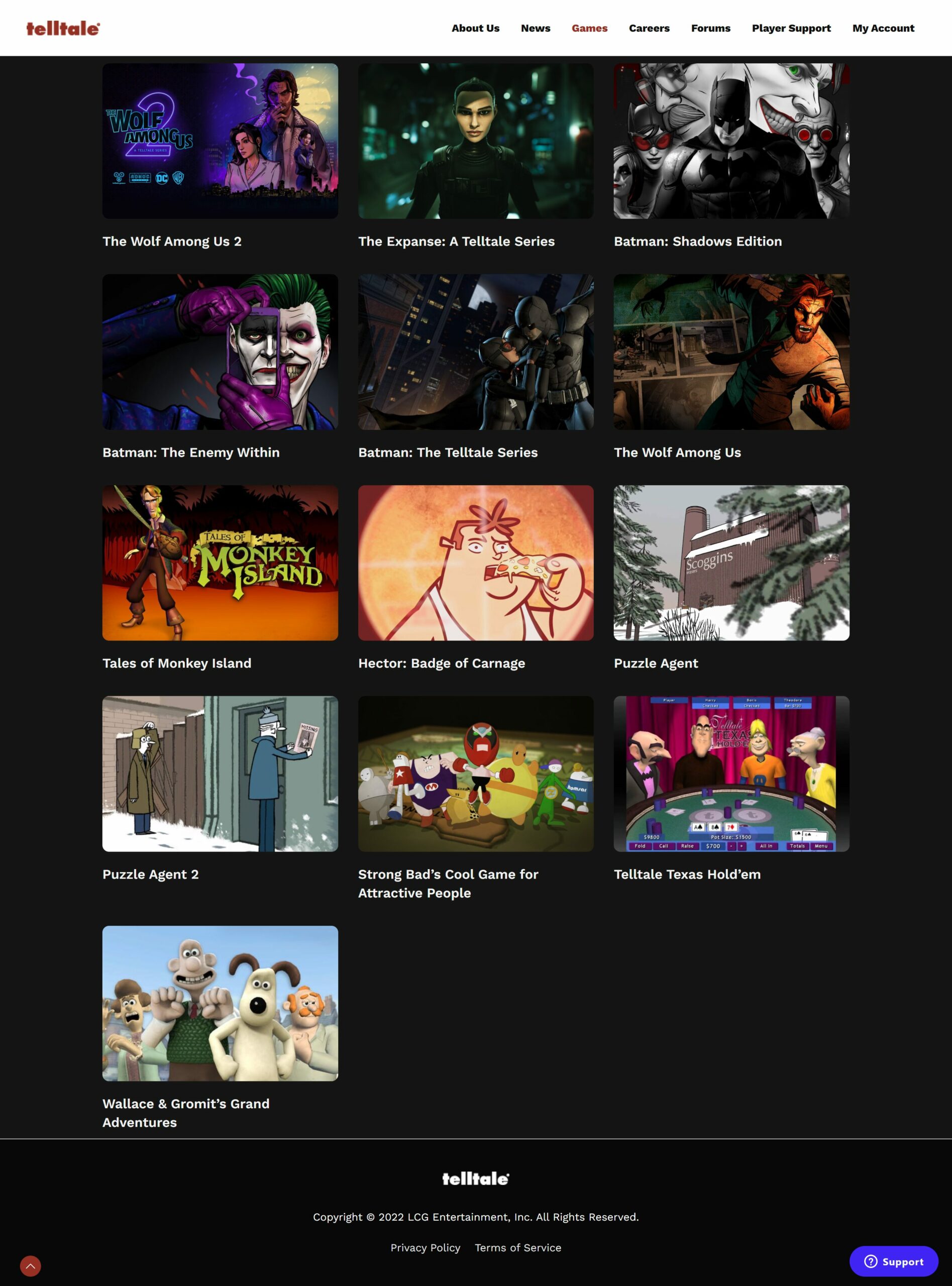
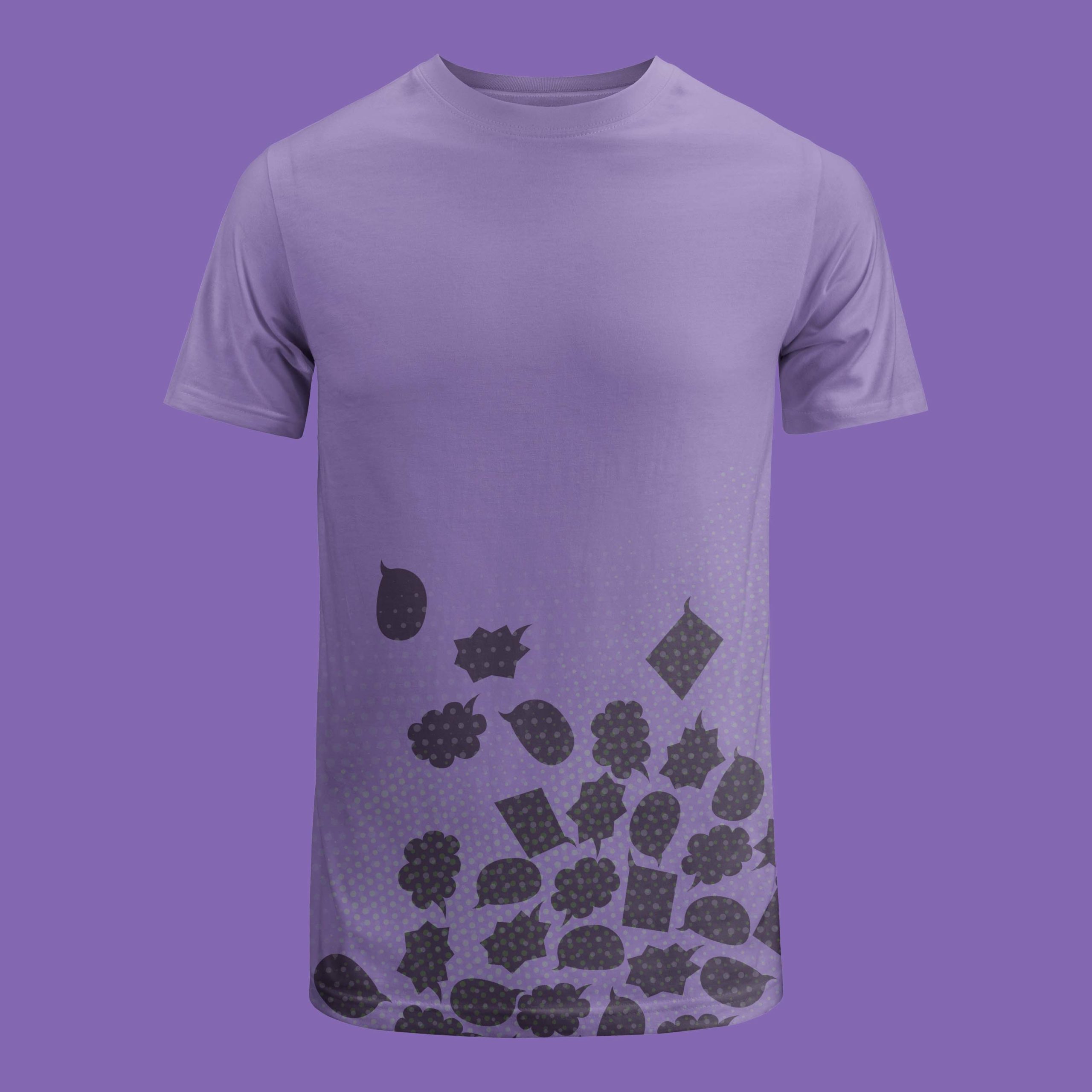
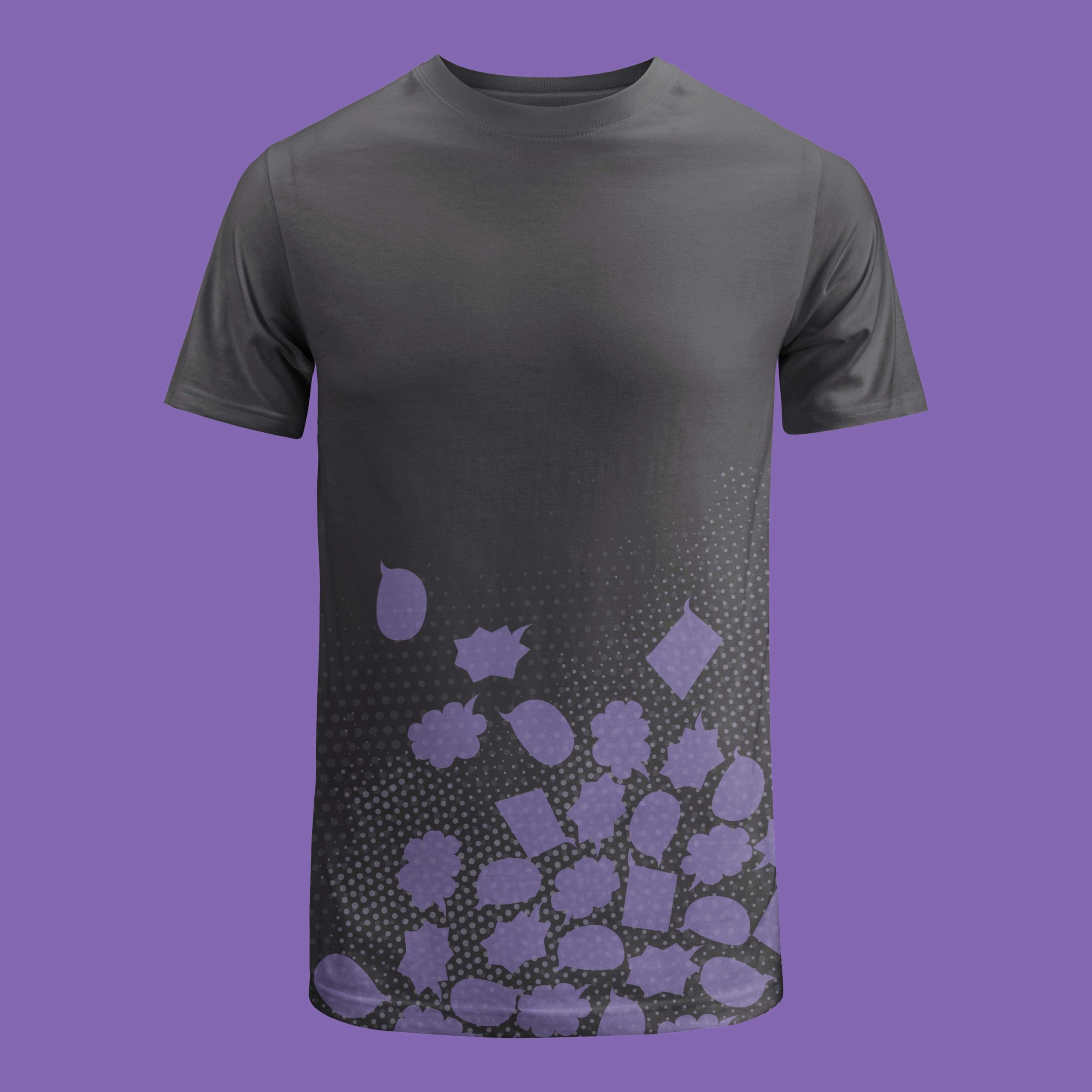
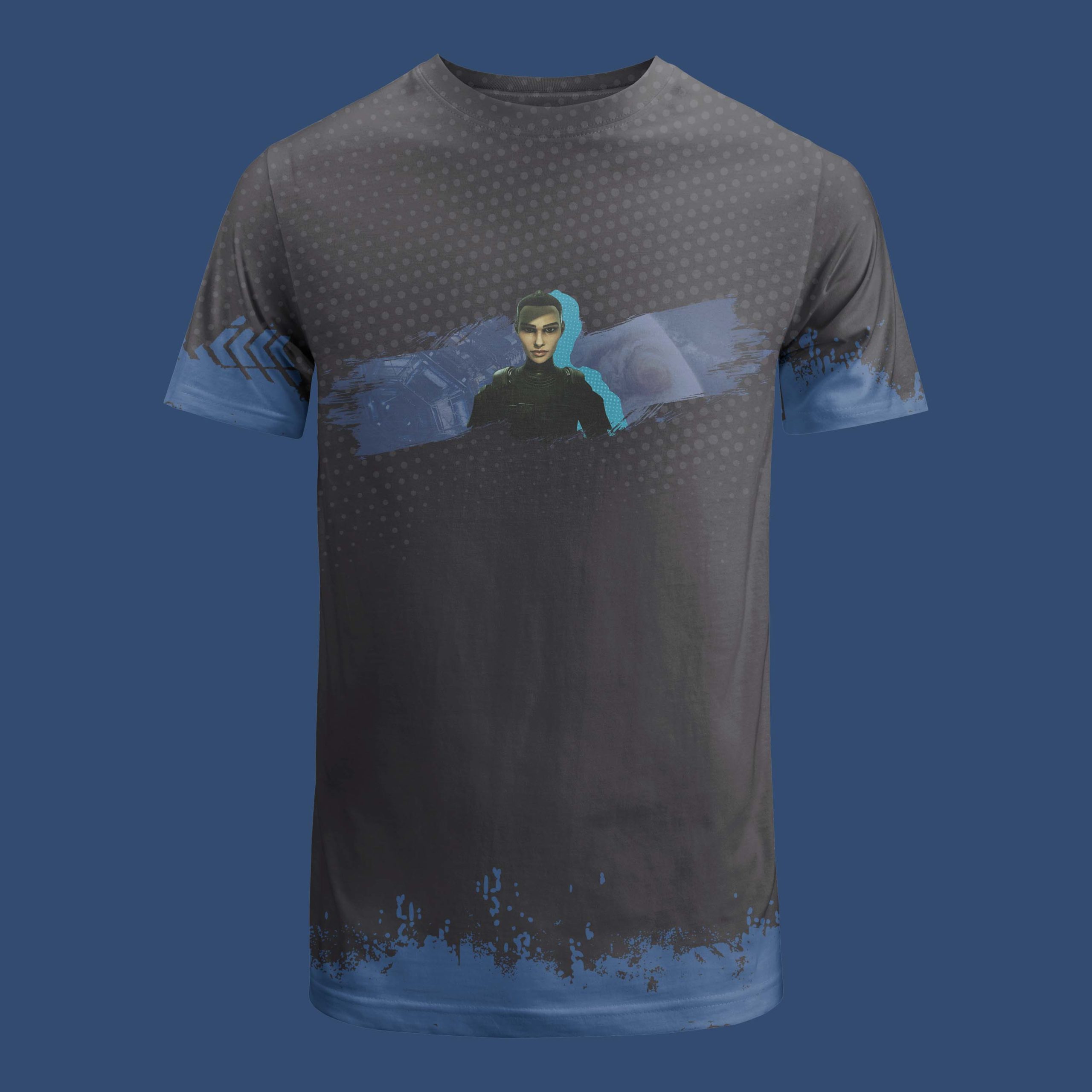
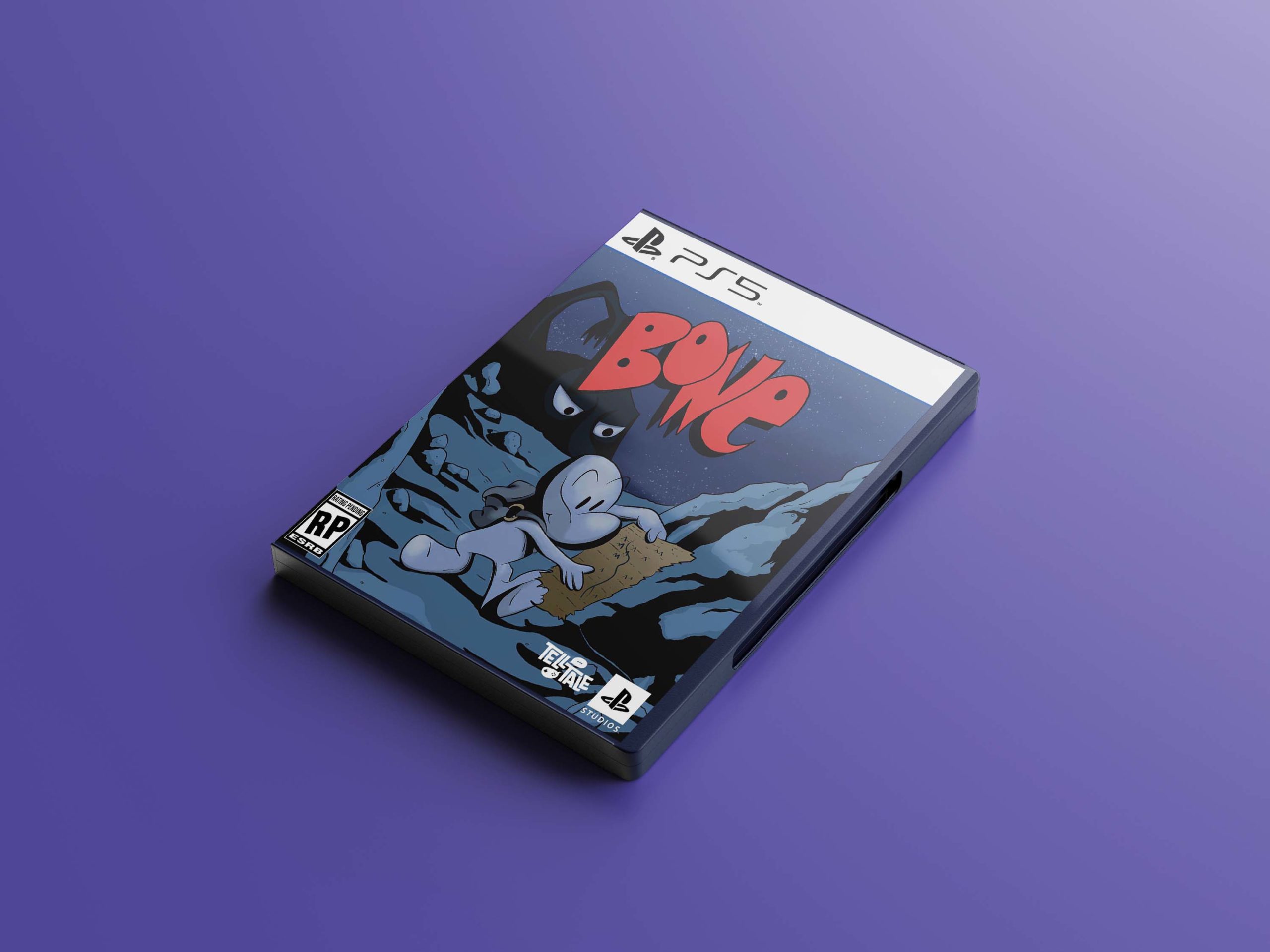
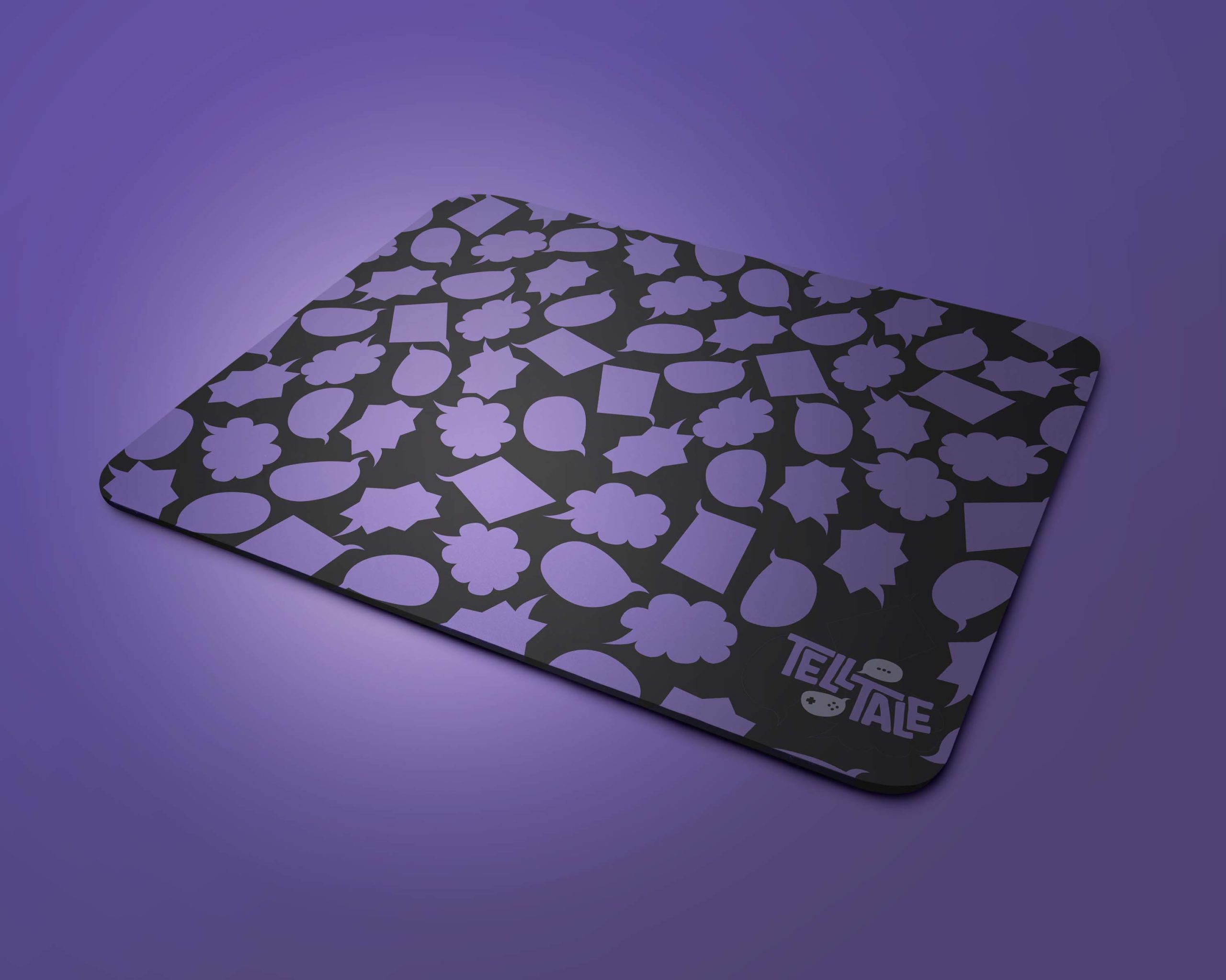
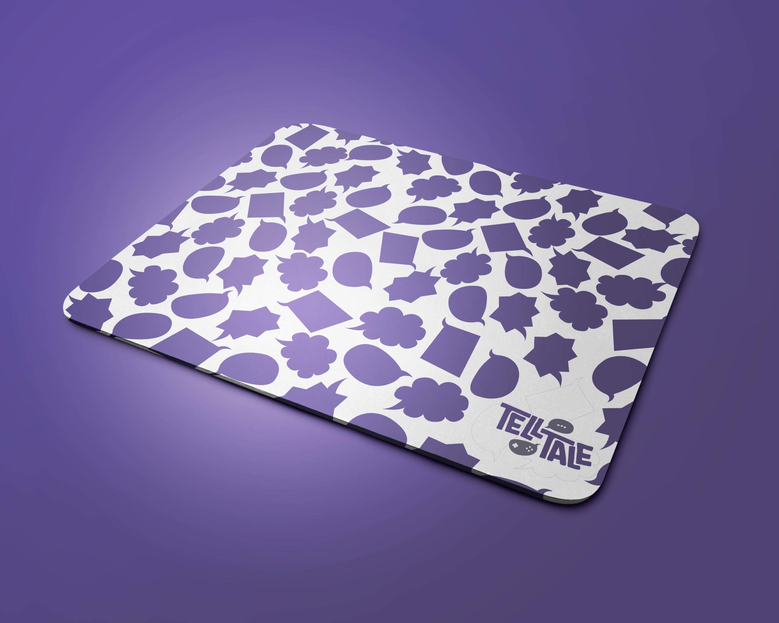
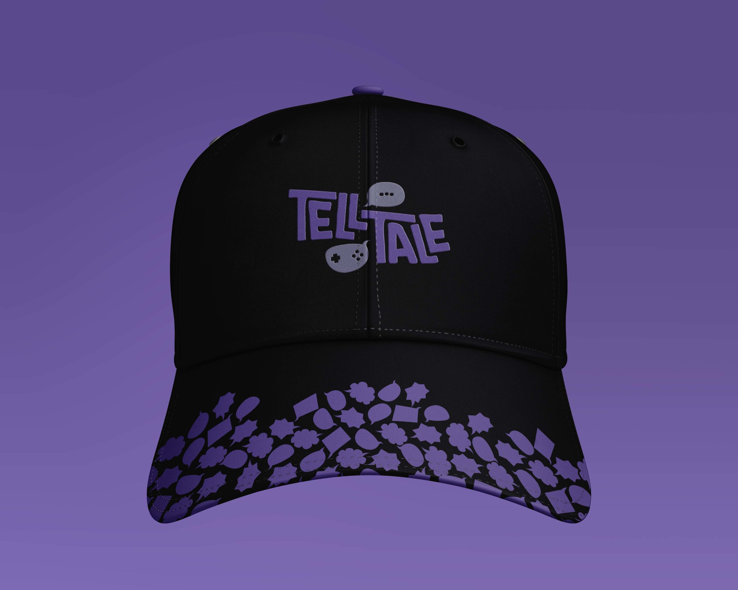
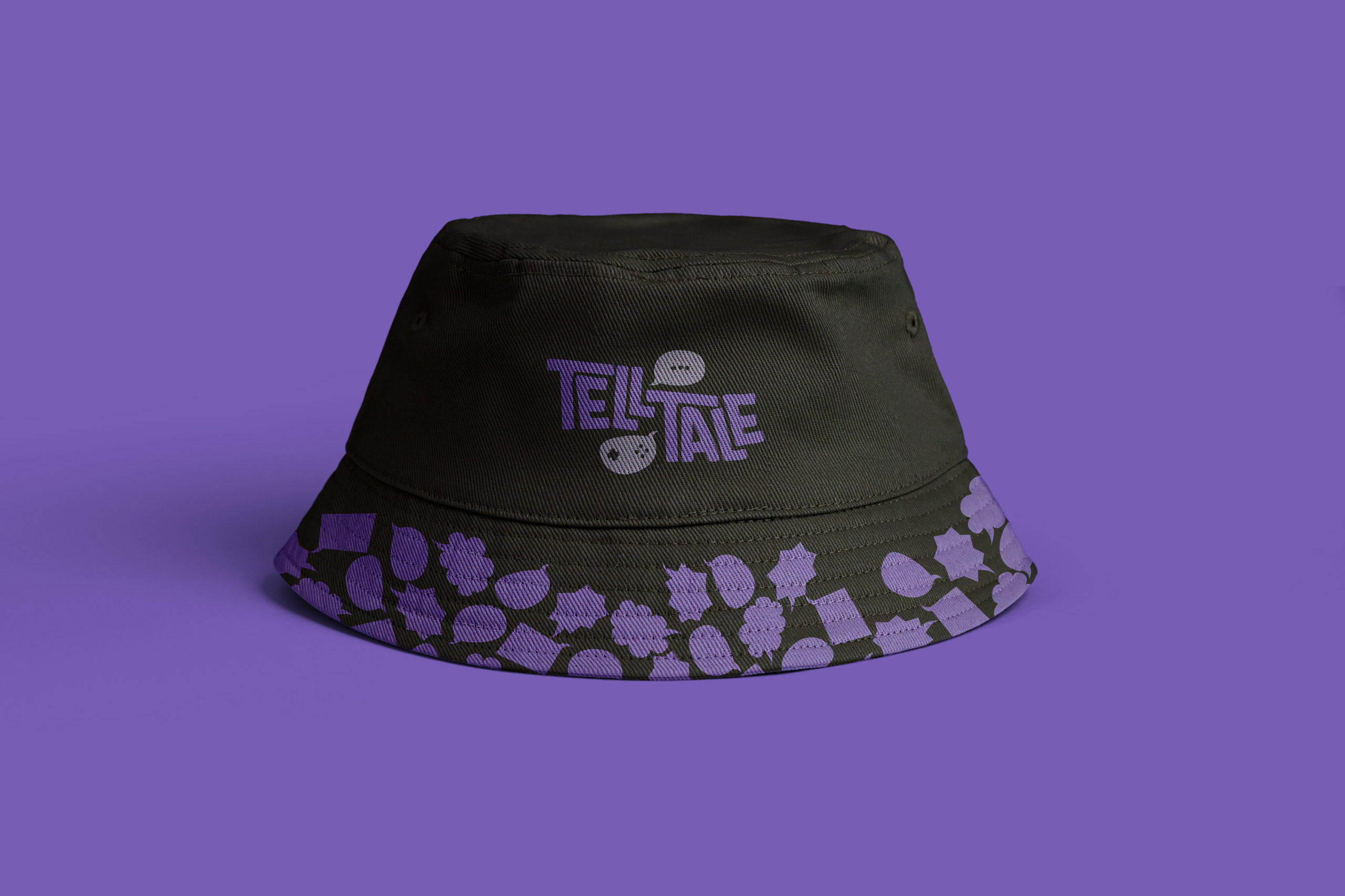
It’s being advertised that the company is “reborn,” and they’re making a comeback with new video game titles. However, the brand itself has remained the same since its beginning. Their brand doesn’t reflect who they are as a company today. Therefore, I took the opportunity to rebrand Telltale Games. I took inspiration from their previous games and spun that concept into this rebrand. Telltale is known for the comic book art style they use in their games and the dark and mature themes they have. I went in a comic book grunge-style direction for this rebrand.

Branding

Logo

The Telltale logo stems from where many of their games are based, comics and books. It’s simple yet eye-catching. The word bubble shape comes from two ideas, the comic book inspiration and the “tell” part of the brand name. The reason there are two-word bubbles is that it’s representative of the choice-based format of the games they develop. The top bubble shows an ellipsis – representing suspense – and the bottom bubble shows a gamepad and buttons – representing a gaming controller. 

Before

After

Color and Type

Rather than having a “primary” color palette, the Telltale brand utilizes an “emphasis” color palette. Since the majority of the background colors will be dark, the emphasis color palette will stand out and pop. The secondary color palette contains muted and darker versions of the main color palette.

For the typography, I chose fonts that stood out and presented the style of comic book/grunge.

Identity Package

For the identity system, I wanted to have the comic book/grunge look to it, but still be simple and clean so that it still portrays a bit of professionalism and has an ease of legibility.

Business Cards

Envelope & Letterhead

Collateral

Website

The original website was simple and clean. While it works as a website, it doesn’t work with their brand personality. In my design solution, I chose to use a majority of white on the page so that it remains easy to look at. However, I still included some dark grunge to fit with the rebrand.

Before

After

Convention

In the gaming community, many conventions are held to connect people and introduce new products or promote existing ones. I thought a convention booth would benefit this rebrand as a way to promote and introduce the “new Telltale” and promote upcoming games.

Ephemera

My initial thoughts when designing ephemera were that it would either be sold at gaming conventions at the Telltale booth, or it’d be limited edition items. This still is the intention, but the thought was expanded into selling merchandise on their website as well as conventions. Limited edition items would mostly be collaborations with other brands, such as the controller I designed for PlayStation consoles.

T-Shirts

Gaming

Mousepads

Hats

Annual Report

This rebrand was created for a class project, with no affiliation to the Telltale Games. My work is not affiliated, associated, authorized, maintained, sponsored, endorsed by, or in any way officially connected with these copyright or trademark holders, Telltale Games.

S.A.M.

41st Holiday Choir Concert